Calling All Marketers
Role
Art Director / Design Lead
Industry
Advertising
Client
Clean Advertising & Design
The Problem
Most agency new business campaigns talk about themselves—focused on credentials, philosophies, and past work. For marketers evaluating agency partners, much of that messaging starts to feel interchangeable.
Clean needed a campaign that could cut through that sameness by being selective rather than expansive—one that made its point of view clear and trusted the right clients to self-identify.


The Insight
The strongest way to attract the right clients isn’t by talking about ourselves—it’s by clearly articulating who we want to work with.
By addressing marketers directly and calling out shared values and frustrations, the campaign could feel less like a pitch and more like a signal—an invitation to the right audience rather than a broadcast to everyone.


The Approach
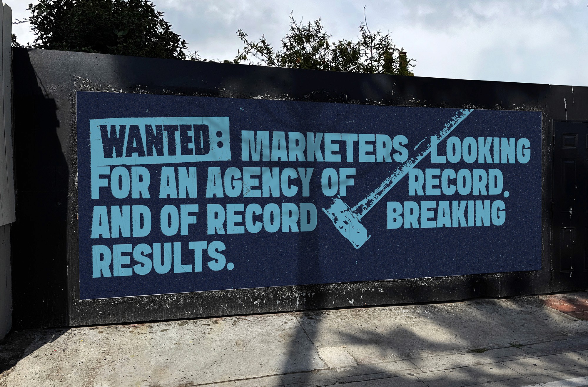
Early explorations focused on type-driven executions. While the direction resonated conceptually, the work needed imagery to fully land across placements.
I evolved the system by introducing illustrative elements inspired by xerox scans and letterpress stamps—creating a poster-forward visual language that felt imperfect and native to nontraditional media. The visuals were designed to guide the viewer through the message, responding directly to key words and phrases. This interplay between copy and image introduced humor and dimensionality while keeping the message clear and direct.


The Outcomes
Calling All Marketers launched as a cohesive new business campaign supporting Clean’s awareness, prospecting, and lead-generation goals across multiple flight dates. The selected visual direction complemented Clean’s existing brand system while introducing new expressive elements—intentionally designed to act as a stepping stone toward future brand evolution.
The campaign provided a flexible foundation for ongoing activations while clearly differentiating Clean in a crowded agency landscape. We saw our greatest success on LinkedIn—where feeds tend to skew clean, polished, and increasingly saturated with AI-generated content. The rough, poster-driven aesthetic stood out as a visual interruption, offering a more human, tactile counterpoint that helped the work cut through.
Tools