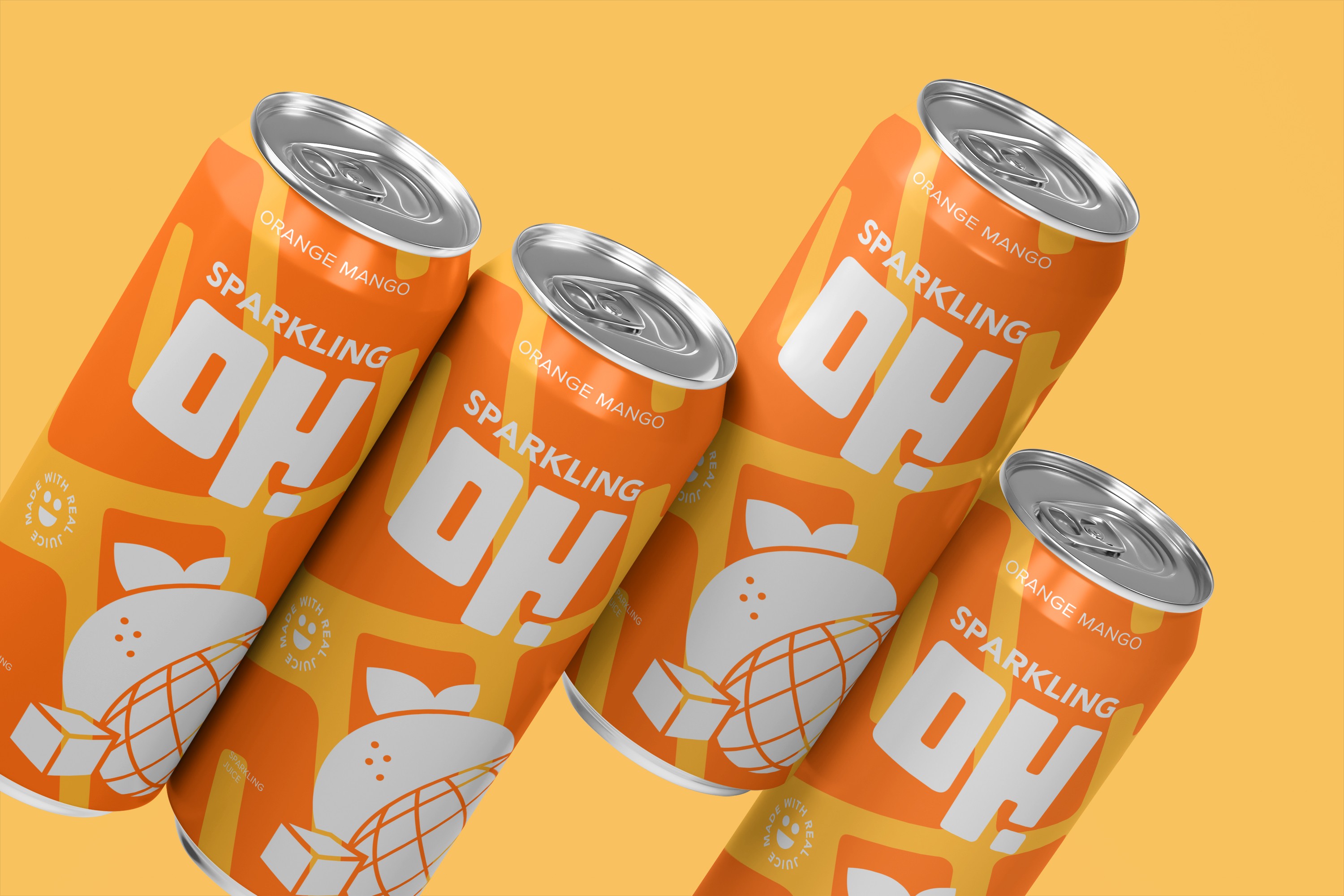
Sparkling Oh!
Role
Design Lead
Industry
Food and Beverage
Client
Pepsi VFB
The Problem
The biggest challenge wasn’t creating something fun—it was perception. As both sparkling beverages and juices increasingly lean into minimal, health-coded design, it is becoming harder to visually communicate flavor. For a kids’ product, that ambiguity would be a miss. Sparkling Oh! needed to read as a bold, flavor-forward juice at first glance.
The Insight
For kids, flavor isn’t subtle—it’s loud and colorful. If a drink doesn’t look exciting, it doesn’t register. Sparkling Oh! needed to lead with flavor in a way that was unmistakable and unapologetic.
The Approach
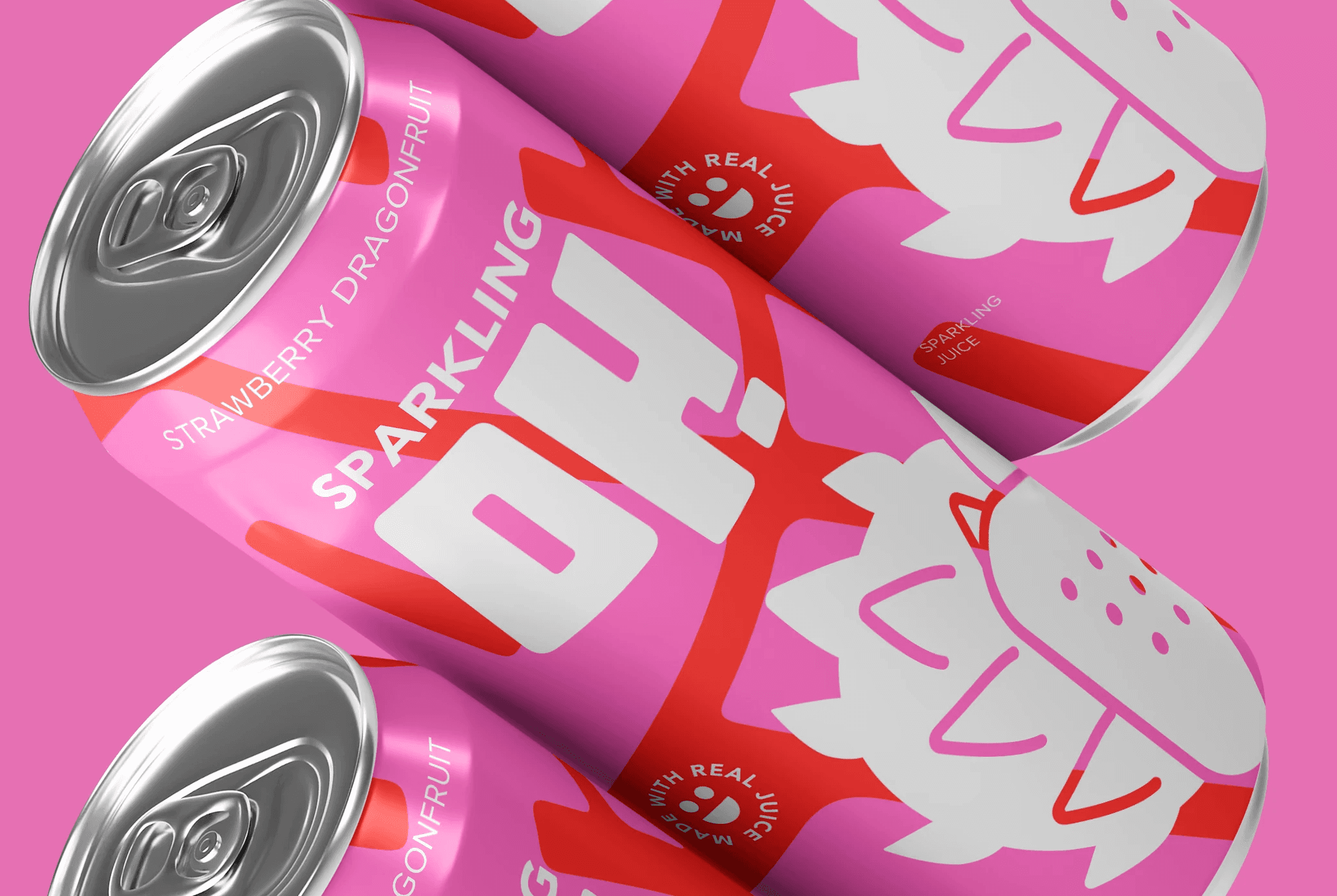
The approach focused on making flavor impossible to miss. Saturated colors, graphic fruit, and expressive scale create immediate recognition, while the clean execution keeps the system modern and appropriate for school settings.
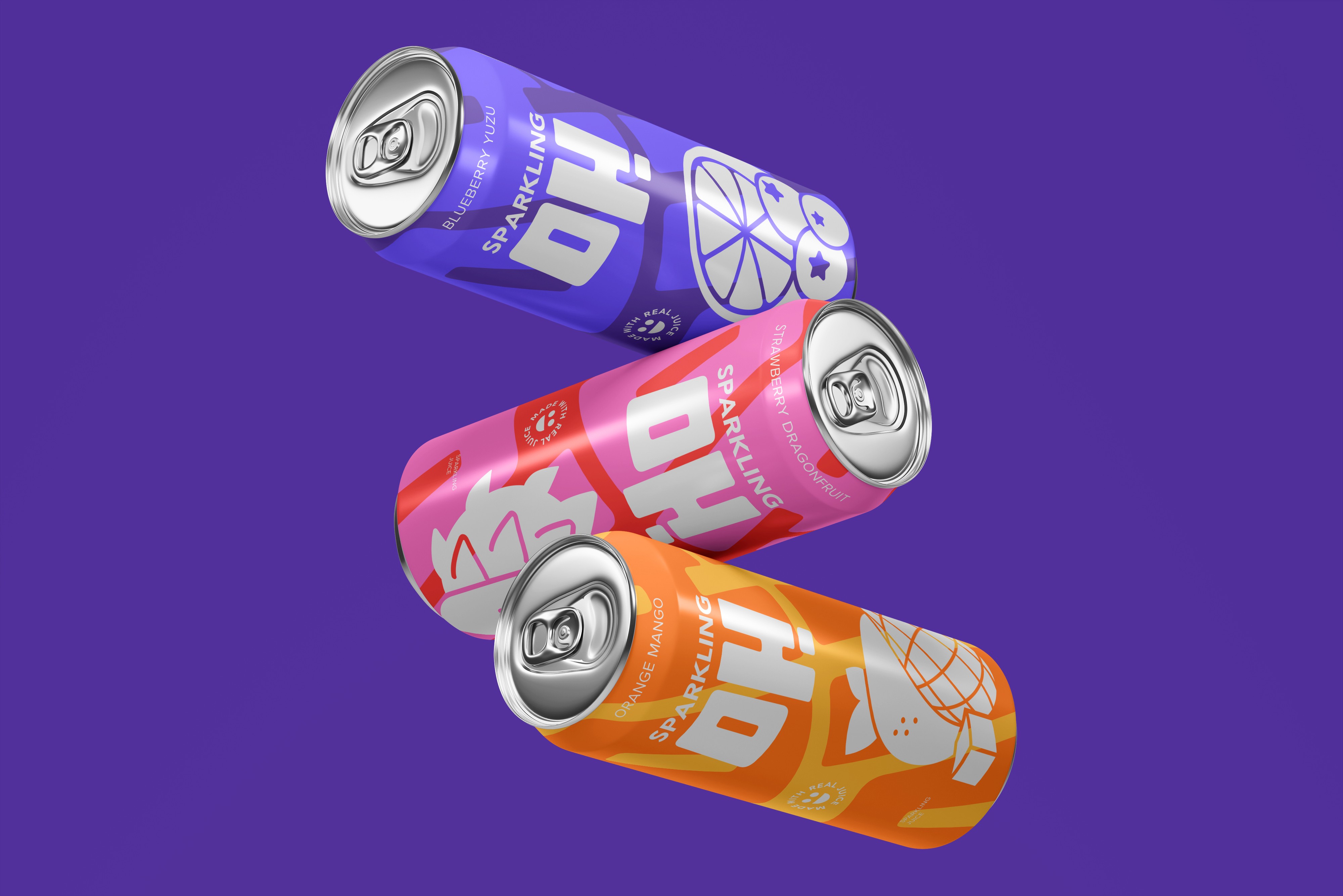
A flexible visual system was built around clear flavor cues, with each flavor anchored by a distinct color and fruit iconography. Consistent layout and typography maintain cohesion across the line.

The Outcomes
The final system clearly distinguishes Sparkling Oh from the visual language of sparkling water, leading with bold color, expressive scale, and immediate flavor recognition.
Among multiple design directions developed for testing, this concept was one of the strongest performers with children and in communicating flavor. While it was not ultimately selected, the results validated the decision to push away from muted sparkling water cues in favor of a bold, flavor-first approach.
Tools