Nightshift Brand System and Digital Assets
Role
Design Lead / Art Direction Lead
Industry
B2B Tech / SaaS
Client
Nightshift / Sylow
The Problem
In a crowded AI market, C-suite executives had grown skeptical of platforms that promised increased productivity but disrupted existing workflows. Nightshift needed to signal a fundamentally different approach—one that integrated quietly rather than interrupting.


The Insight
The strongest innovation doesn't disrupt—it integrates. Instead of forcing teams to adapt, Nightshift fits into how people already work, operating quietly in the background.
That invisible integration became the differentiator.


The Approach
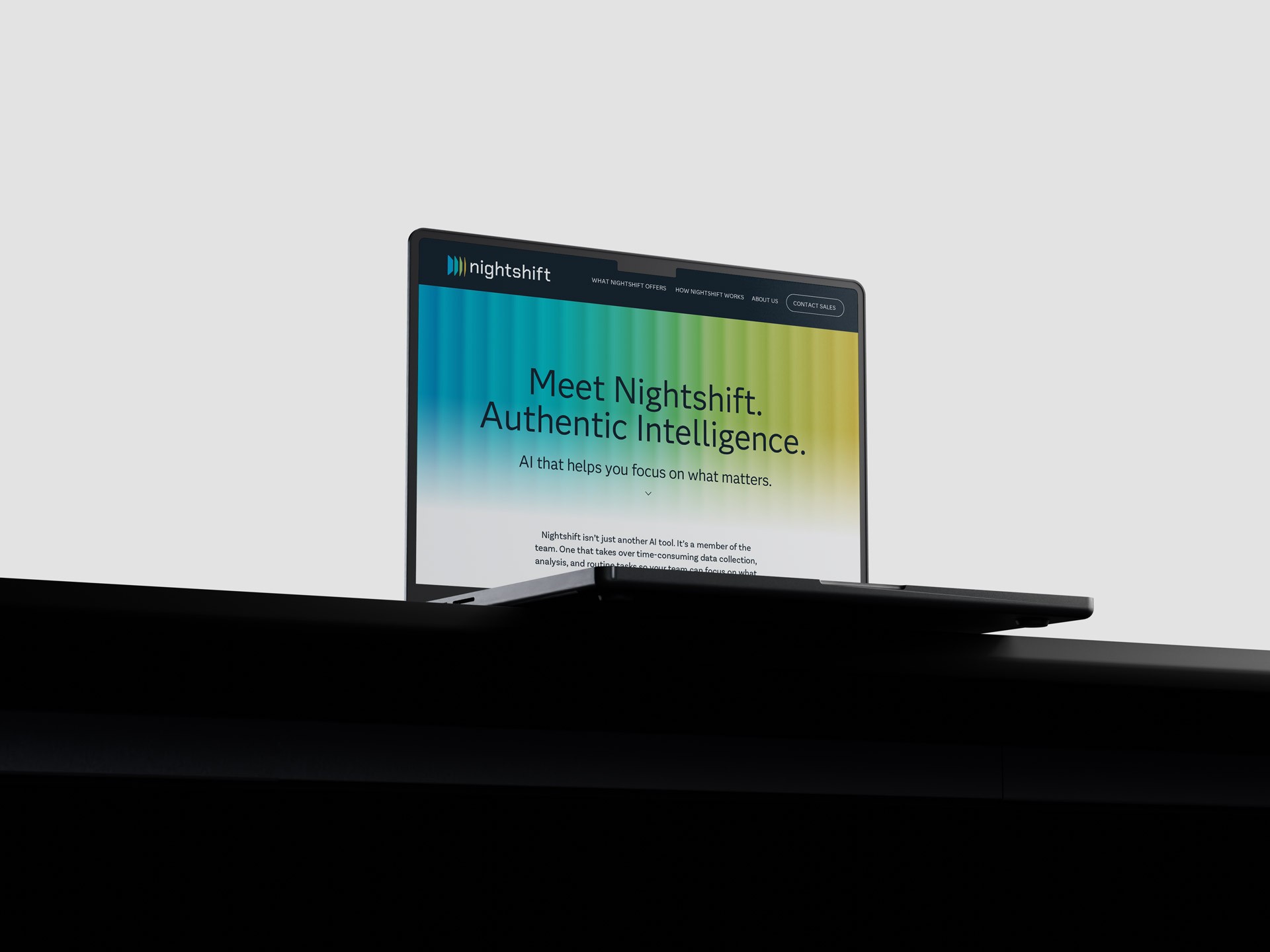
Two aesthetic directions emerged from the brand workshop—dark and rich and light and airy. Rather than choose between them, I unified both through a core metaphor: dusk and dawn, moments where light and dark coexist—a parallel for a product that works quietly in the background while still driving change.
That idea became a visual system built around light in transition. The landing page uses a time-based radiating gradient that shifts with the user's system clock—Morning, Day, Afternoon, Evening—creating a calm, ambient experience that reflects how Nightshift integrates into daily work.


The Outcomes
The landing page concept resonated immediately with the client and stakeholders, particularly the time-shifting header. That response expanded the original scope into social templates, a mobile version, and early interface design for the platform.
Tools